A spectrogram shows the frequency content of a signal over time.
That is to say, the spectrogram shows the magnitude of frequencies in the signal (the magnitude response of the signal) at each point of time in some time interval.
An example spectrogram of a snare hit
The following is a spectrogram of the first 100 milliseconds of a snare hit.
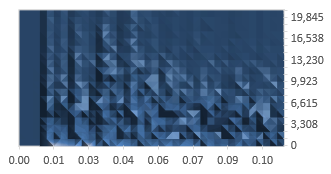
The horizontal axis shows the time in seconds. The vertical axis shows the frequencies in Hz. This graph was produced using a snare recorded with the sampling frequency 44,100 Hz and so the vertical axis ends at the Nyquist frequency of 22,050 Hz. At each point of time and for each frequency, the lighter colors represent higher magnitude of the frequency, and darker colors represent lower magnitude of the frequency.
This particular graph was computed using a 40-point discrete Fourier transform (only 20 points are useful, as the transform over a real valued signal produces duplicate information). Thus, only 20 values are presented for each point of time. In addition, the discrete Fourier transform was only taken approximately once every 3 milliseconds, which means that there was no overlap and the graph is relatively imprecise.
Add new comment